Lots of Indie Devs don’t put nearly enough work into their visuals which truly is a shame because it’s usually the main thing that influences if a player buys your game. I’m not saying you need custom art or fancy models, sometimes a few post-processing and lighting tweaks can completely change your game’s look for the better!
Here are 4 simple tweaks to dramatically improve your game’s visuals!
To properly showcase the impact of these settings I made a scene in Unreal Engine out of the most basic shapes, our goal will be to turn this scene into something good-looking!
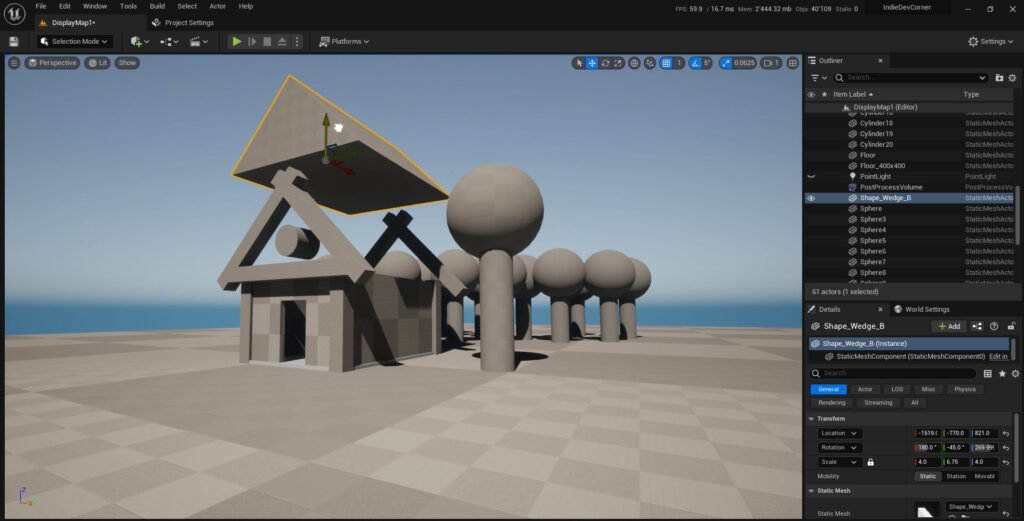
1. Let’s start with some Color Theory!
Honestly, I don’t have a deep knowledge of color theory but there are a few rules that I follow and apply to my games.
First off, choose 2-3 dominant colors that fit together for your scene/game, I recommend choosing pallets of movies or other games that fit the vibe/ environment you’re trying to make. In the case of our scene, I kept it simple, Brown, green, and blue. the rest was either the color white which somehow always looks good everywhere or a variation of the main colors, like a lighter brown or a darker green.
I’m not saying you’re not allowed to use more colors BUT you just try to stick to them as much as you can. This will make the environment less chaotic and busy. Another tip I can give you here is also to choose an additional color that heavily contrasts next to your other colors to make your player naturally attracted to certain objects, for example in our scene we could have a bright red object on the floor that will automatically get our attention because it’s the only object with that color in our scene. Just keep in mind that this only works if this is the rarest color in your game.
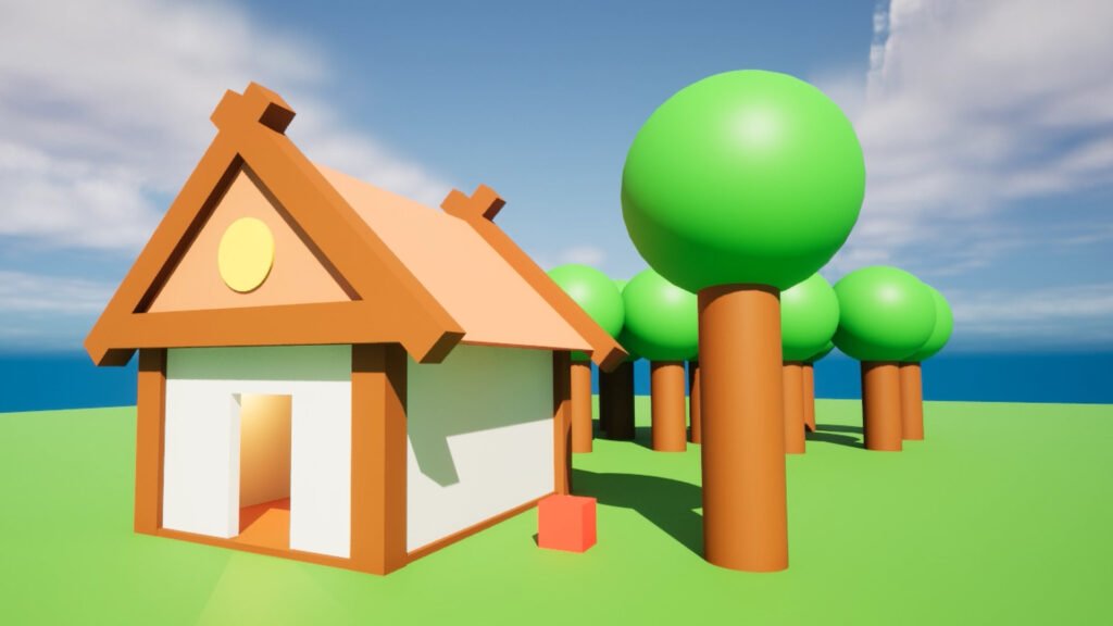
2. Now the second setting we’ll look at is Lighting and Glow!
- Adjusting and adding lights in key areas can really improve your game’s look, but it’s not only about brightening up your scene, it’s also about adding shadows and darkness in the right places. With our fake game scene here I decided I wanted to have a soft shadow on the side and added a little light inside our dark house.
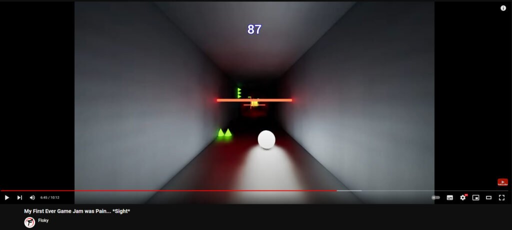
- Another easy way to enhance the look of most games is by making stuff glow, it sounds stupid but shiny and glowing stuff just looks cool, I discovered this in my very first game jam, I had very little experience in game development and decided to only use the most basic shapes to make a game, and just by adding a glow to the different shapes I gave my game a very unique and appealing look, a happy discovery that even to this day I still apply to a lot of my games. When it comes to our scene here, I’m not going to make anything glow because in this case, I don’t think it fits.
3. With The third step, we’re going to explore Post-Processing effects
Now I know this seems a bit obvious but bear with me because most of you still completely underutilise this insane visual tool!
Before we jump into this, I want to point out that Mastering Post-processing stuff is an entire job in itself and I’m not going to pretend I know how to do all the fancy stuff, however, I can teach you a few very simple tweaks that I picked up and use to make my games stand out.
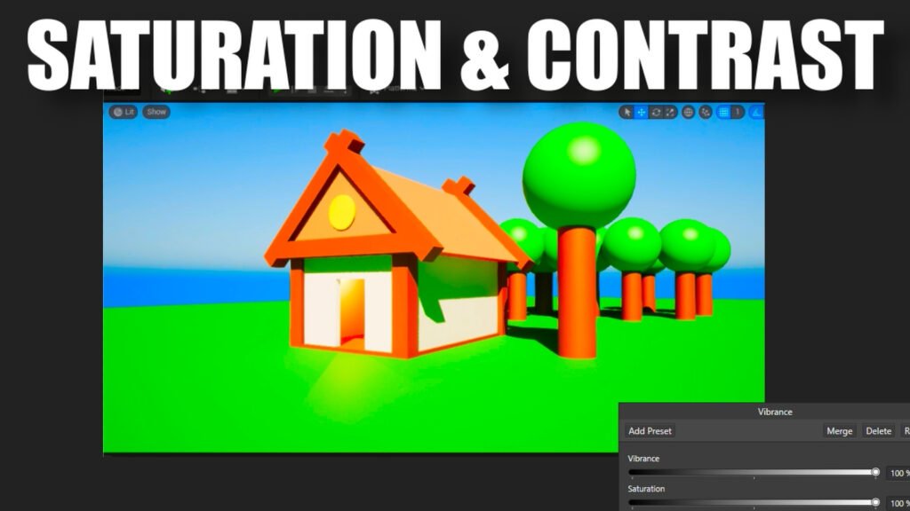
First of all, we have saturation and contrast. Tweaking these two settings will already change your game significantly.
For example, if you’re making a game that has a lot of natural elements and vibrant colors, you should try to slightly increase the saturation and contrast, this will make all the important colors pop even more and give your game this vibrant aesthetic, it’s what I did for my survival game prototype I worked on a year ago,
and I think the views I got on my video are mainly thanks to this hyper-saturated environment and thumbnail.

Now I’m not saying that you should just go ahead and crank up the saturation and contrast levels of your game to the max, in some cases it might look better to do the opposite, giving your game a desaturated look might help in making your environment feel less welcoming, more depressing and hostile… just tweak those settings slightly and make it fit your game.
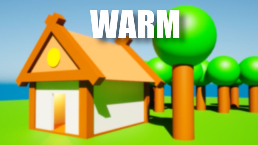
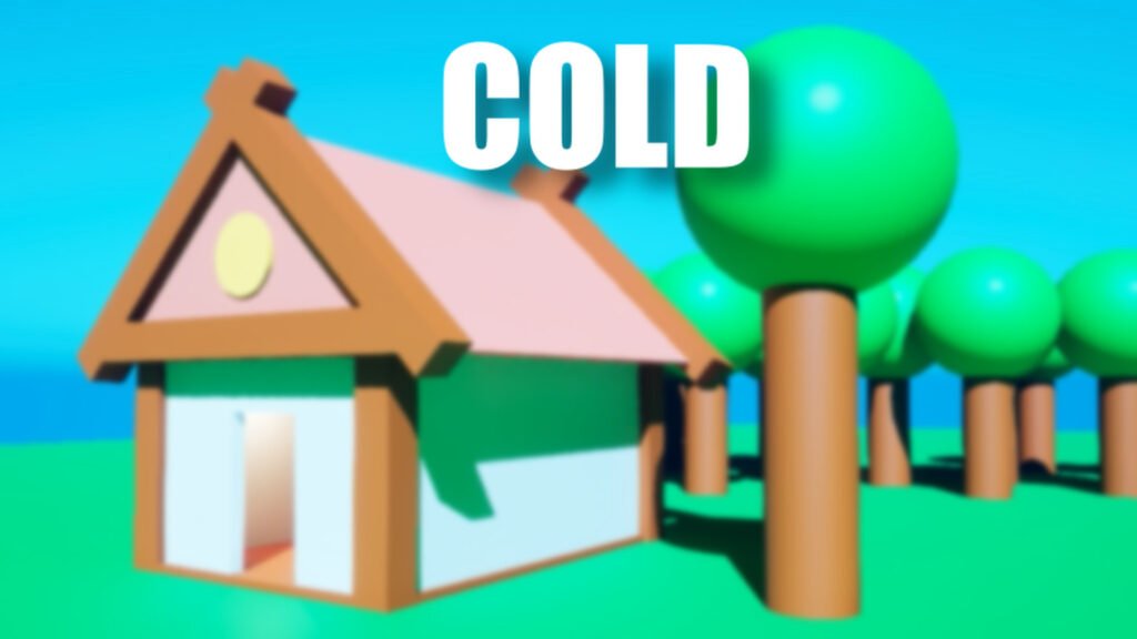
The second setting we are going to look at is the temperature setting, this is a simple ideal way to give your scene a warm or cold touch. This again will depend on your setting but in this case, I think the scene should have a slight warm tropical touch.
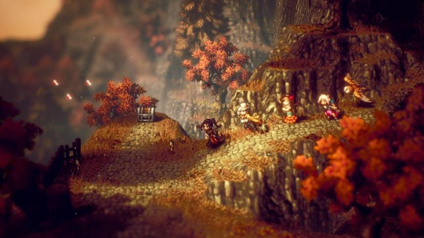
Then we have depth of field, which is one of my favorite settings, it makes things look blurry in the background but makes things close up look more crisp and focused, a perfect example of this practice is Octopath Travelers, the depth of field here really makes the game stand out and unique, let’s apply it to our scene.
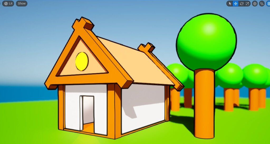
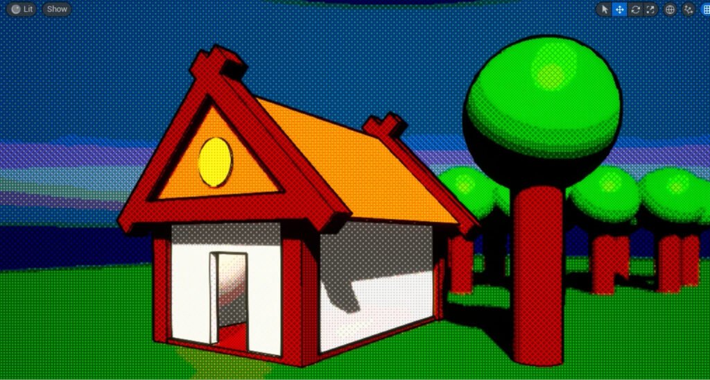
The final post-process option is slightly more complicated, and that is applying a post-processing material, this could be a toon shader, an outline shader, a mix of both, or any other cool visual-altering shader. You can find loads of tutorials online on how to create these shaders or you can also find some really good-looking shaders in various asset stores for quite cheap!
4. A Skybox!
The last part of this experiment is probably the most simple change you can make, using a fitting skybox! For those that don’t know, a sky box is a huge inverted sphere with a texture applied to it, for our scene, I’m using this free anime skybox I found on sketch fab, and that’s the last piece of our puzzle, I personally really like the way this turned out and I hope it gave you some insight into how to improve the looks of your own game!

Thanks for reading and best of luck with your games!
